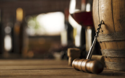
A major hurdle that most wine producers hit is the dreaded label design. Although information about TTB requirements is readily available, it can sometimes feel like the regulations are written in a foreign language. Certain TTB terms and font sizing requirements can be tricky. This article is intended to take some mystery out of this aspect of label design for American wines. Of course, exceptions apply, and this article should be read as a foundation of knowledge, and not as specific legal advice for your individual label design. For assistance with your label’s compliance, or to discuss your label’s design, contact us.
All wine labels must include the wine’s brand name, class, name and address of the bottler or packer, net contents, FTC yellow dye #5 (if applicable), color additives (if applicable), sulfites declaration (if applicable), alcohol content statement, and the government warning statement. While all of these categories have their own special substantive requirements, font size and spacing requirements also exist.
BRAND, CLASS, NAME and ADDRESS, NET CONTENTS, DYES, ADDITIVES, and SULFITES:
For wine containers up to 187 ml (splits), the brand, class, name and address, net contents (as opposed to alcohol content), FTC yellow dye, and sulfites declaration must be, “in script, type, or printing not smaller than 1 millimeter, unless contained among other descriptive or explanatory information, in which case the script, type, or printing of the mandatory information must be of a size substantially more conspicuous than that of the descriptive or explanatory information.” For wine containers larger than 187 ml up to 3 liters (half bottles, bottles, magnums, double magnums, etc.), and wine containers larger than 3 liters, the requirements are identical, except that the millimeter size is increased from 1 to 2.
So what does this mean? Let’s start with “script, type or printing.” Script is a way to describe handwriting. Most people think of this as cursive writing, but it actually encompasses any font that has the appearance of being lettered by hand, even if the letters are not in cursive. Type and print both refer to using block lettering, one by hand and one with either a typewriter or printer. Easy enough so far.
Next comes sizing, which is a bit trickier. The 1 millimeter measurement refers to the space between the baseline and cap-height. The baseline is the location that the letters appear to sit on. Think of the lines on lined paper. The cap-height is the height from the baseline to the top of an uppercase letter. Fontshop.com’s handy glossary graphic provides a picture for those of us who are more visual:

If a wine label has lower case lettering, even the lower case letters need to meet the minimum height standards. For wine containers up to 187 ml, this information has to be presented in a font that is at least 1 millimeter tall. For larger wine containers, the size increases to 2 millimeters.
The next section, beginning with the dreaded “UNLESS” is actually pretty simple. If contained among other descriptive or explanatory information, the brand, class, name and address, net contents, yellow dye, and sulfite declaration must be “substantially more conspicuous” than that of the descriptive or explanatory information. By providing this non-specific requirement, the TTB actually gives label designers some discretion. For example, if this information is included among a flowery description of the wine, the required information must be set apart with larger, bolder, or otherwise more noticeable font.
ALCOHOL CONTENT STATEMENT
Next things next. The alcohol content statement tells the consumer what percent of alcohol the wine contains. Per the TTB, “Alcoholic content statements must not appear in script, type, or printing larger or more conspicuous than 3 millimeters nor smaller than 1 millimeter on labels of containers having a capacity of 5 liters or less.” Even though it’s worded a little differently, the alcohol content statement must be in script, type, or print. So, for bottles 5L or less (all the usual sized, and most of the very large bottles), the size requirement on the alcohol content text is between 1millimeter and 3millimeters in height and readable.
GOVERNMENT WARNING STATEMENT
This label requirement is the most direct, and allows for zero creativity. For all wine container sizes, TTB requires that the first two words of this statement appear in all caps and bold, i.e. “GOVERNMENT WARNING.” The rest of the description does not have to be bold, but should stay in all caps. For wine containers up to 187 ml, the type must be at least 1 millimeter tall. For wine containers between 188 ml and up to 3 liters, the font size increases to at least 2 millimeters. For wine containers larger than 3 liters the minimum font height is 3 millimeters.
In addition to the font height requirement, there is also a linear text requirement to ensure that this portion of the label isn’t smashed together. For containers up to 187 ml, this part of the label may have a maximum of 40 characters per inch. Characters include letters, numbers, and marks (including punctuation). Spaces are excluded. For 188 ml to 3 L, the spacing becomes 25 characters per inch. For larger wine containers, the spacing increases to 12 characters per inch.
Clearly, there is a lot to know, font and size requirements are just the tip on the wine label iceberg. Regulations and restrictions of content will be the subject of future posts.